
Deko is a multi-lender payment platform designed to enable flexible checkout finance for both merchants and consumers. Its core proposition is to support any basket, anytime, anywhere, allowing businesses to offer tailored financing options seamlessly within the purchasing journey.
The platform connects multiple lenders in a single ecosystem, intelligently matching customers with suitable finance options to improve conversion rates and create a smoother checkout experience. By centralising lender integrations, Deko reduces complexity for merchants while increasing accessibility to finance for end users.
With a strong focus on scalability and continuous expansion, Deko evolves its offering to meet diverse business needs, positioning itself as a trusted partner in retail finance. Its product culture is grounded in clear values - doing the right thing, being bold, and operating as one team - which support collaborative delivery and customer-centric decision-making.
Finance Application Form
Optimising a multi-channel B2C journey for conversion, clarity, and scalability.
Overview
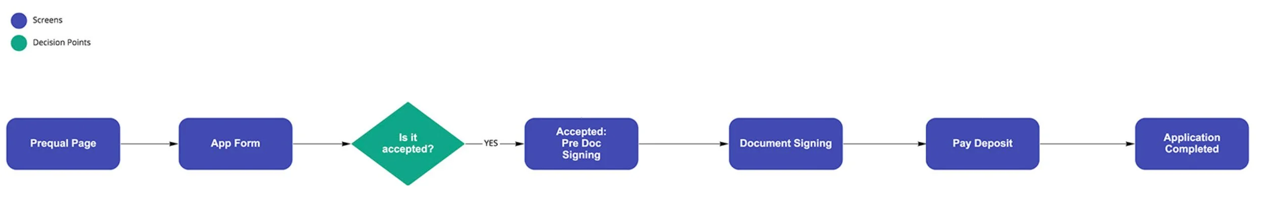
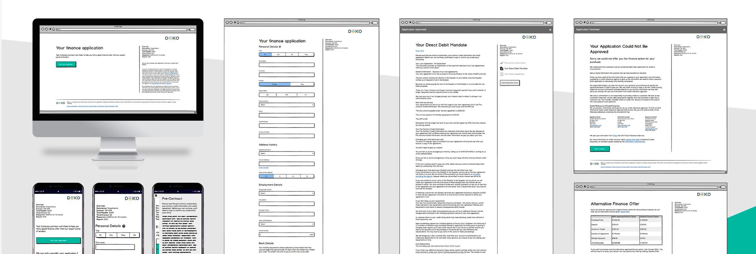
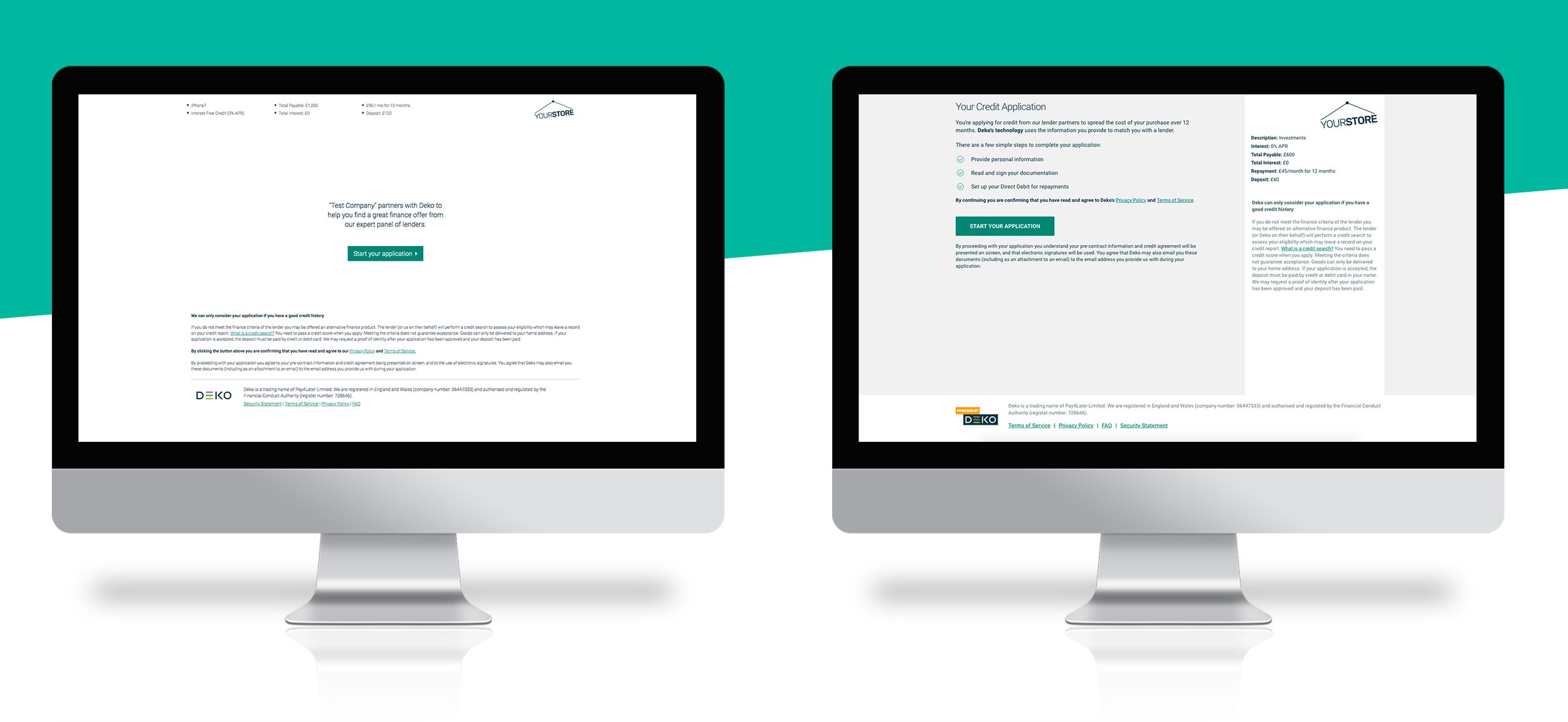
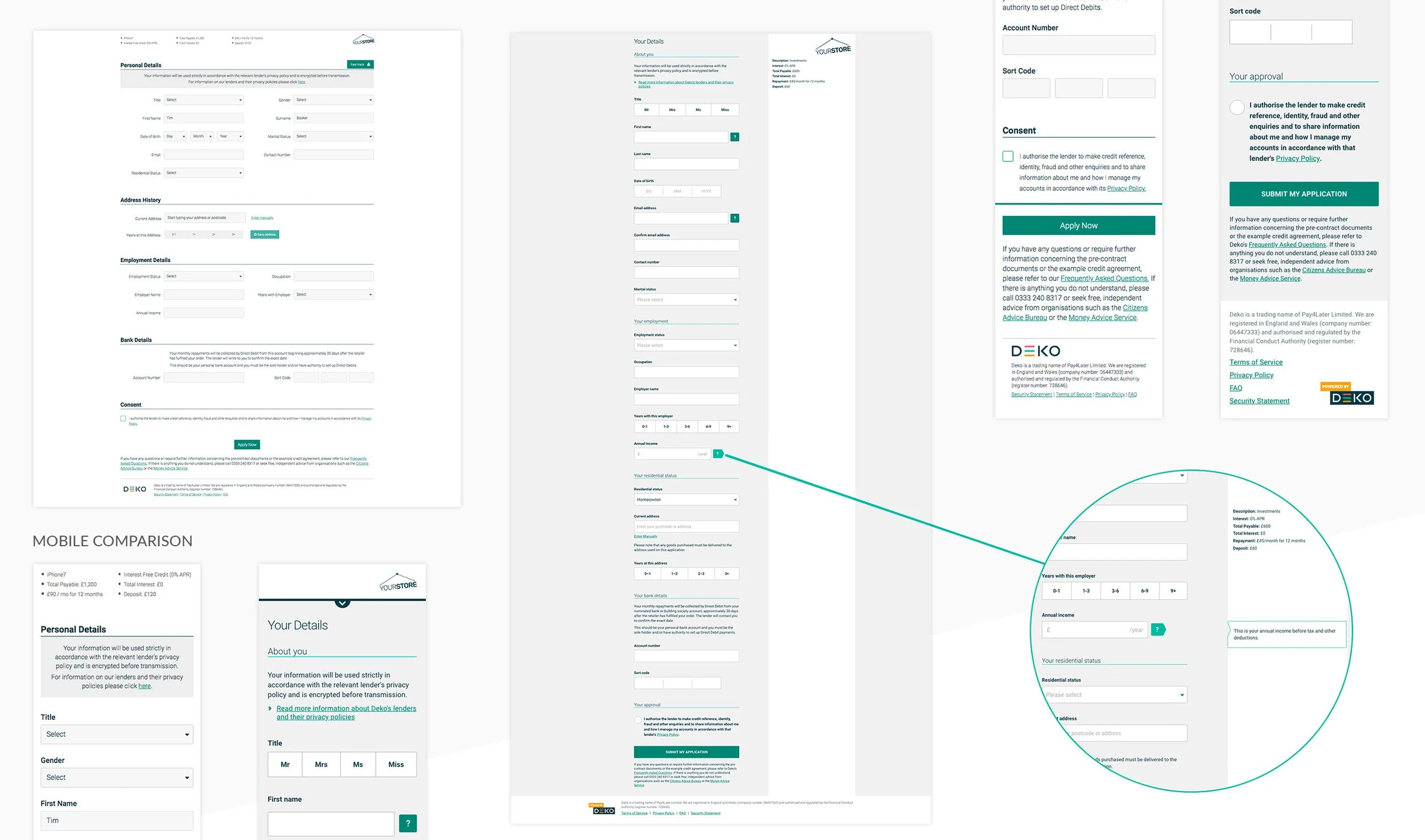
The Deko Finance Application Form was the company’s core product experience, enabling consumers to apply for finance across multiple channels, including online, in-store, phone, and email journeys. As an omni-channel product, the application needed to provide a consistent and seamless experience across different touchpoints while serving a diverse ecosystem of users: end customers, merchants, and lenders. The project focused on redesigning and optimising the application journey, with a particular emphasis on improving mobile experience, reducing drop-offs, and enabling faster product iteration.
My Role
Product Designer
I worked within a cross-functional product team, contributing to:
end-to-end UX and UI redesign of the application journey
user research and testing across multiple user groups
defining a mobile-first design approach
collaborating with engineering on scalable front-end architecture
supporting the introduction of A/B and multivariate testing capabilities
Team Structure
The product was developed within cross-functional teams consisting of:
Product Designer (my role)
Product Manager
Frontend and Backend Engineers
QA (introduced in later stages)
Multiple teams worked in parallel across different product areas, requiring strong alignment and coordination.
The Problem
Through both internal and external feedback, we identified several critical issues within the application journey. Despite the majority of users being mobile-first (approximately 65%), the experience was not optimised for mobile devices, resulting in significant drop-offs. The form lacked clear feedback and guidance, creating confusion and increasing friction during completion.
Additionally, the technical setup limited the team’s ability to run experiments and iterate quickly, slowing down learning cycles and reducing confidence in releases. This contributed to regressions in functionality and increased operational overhead, particularly in the form of customer support queries and lender calls.
The ongoing company rebrand created an opportunity to revisit the entire experience, aligning both UX and UI improvements with a broader product transformation.
Users
The product served a multi-sided ecosystem:
Consumers applying for finance (primary focus)
Merchants offering finance options
Lenders providing financial products
The initial phase of optimisation focused on improving the end-user (B2C) experience, where the most significant friction and drop-offs occurred.
Research & Discovery
The Finance Application Form was one of Deko’s core commercial products and a critical entry point into the wider lending ecosystem. Because the platform operated across multiple channels - online, in-store, phone, and email journeys - the discovery phase focused not only on isolated usability issues, but on understanding the broader behavioural patterns and operational friction affecting conversion across the full application experience.
The initial research uncovered that 65% of customers were completing applications on mobile devices, yet the experience had not been designed with a mobile-first approach. This mismatch created substantial usability problems, increased abandonment rates, and negatively impacted customer confidence during the application process.
To better understand the underlying causes behind drop-offs and support requests, we conducted a combination of:
user testing sessions
customer interviews
surveys
analytics reviews
stakeholder feedback workshops
We analysed behavioural patterns through Google Analytics and additional operational insights gathered from customer support teams, lenders, merchants, account managers, and TrustPilot reviews. This combination of qualitative and quantitative research helped identify both visible usability issues and deeper structural problems within the journey.
Some of the key findings included:
lack of progress visibility causing uncertainty during applications
insufficient feedback and error handling
inconsistent mobile interactions
overly complex form structures
unclear document signing flows
technical limitations slowing experimentation and product learning
The research phase also highlighted an important operational issue internally: the inability to rapidly run A/B and multivariate testing significantly limited product optimisation and reduced confidence in iterative releases. This meant the project needed to address not only UX improvements, but also the technical flexibility required for continuous experimentation and product evolution.
The ongoing rebrand happening within Deko created an additional opportunity to revisit the product holistically. Rather than treating the redesign as purely visual, we used the initiative to reassess the entire customer journey, interaction patterns, messaging hierarchy, and technical foundations supporting the experience.
Design Approach
The design approach focused on simplifying the finance application journey while improving clarity, trust, and completion confidence across all device types. Given the complexity and sensitivity of financial applications, the primary objective was reducing user anxiety and cognitive load without oversimplifying the regulatory and operational requirements of the process.
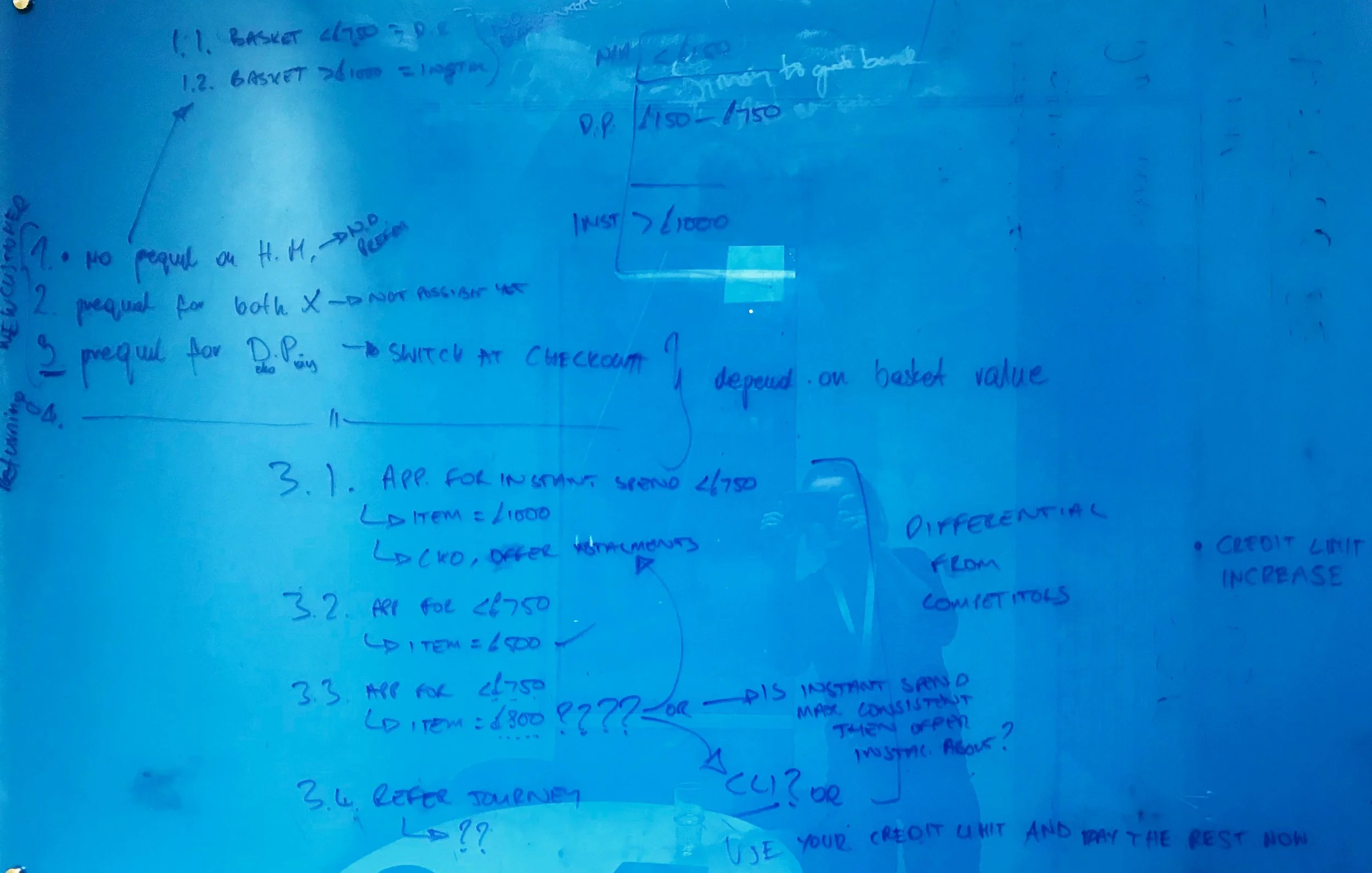
We adopted a mobile-first design strategy, ensuring the experience worked efficiently for the majority mobile audience while naturally improving responsiveness and usability across desktop environments as well. Early concepts were explored through sketches, wireframes, and clickable prototypes, allowing us to validate more complex interaction changes before development.
Key improvements included:
introducing clear progress indicators to improve orientation
simplifying form structure and removing unnecessary fields
improving error handling and inline guidance
integrating services such as address lookup and ID verification
refining content and microcopy to better explain the process
redesigning the document signing experience for clarity
At the same time, we worked closely with engineering to enable A/B and multivariate testing, allowing the team to validate changes and continuously optimise the experience.
The redesign introduced clearer journey progression, more informative copy, simplified error handling, contextual guidance, and streamlined input structures. The work also involved simplifying operational friction points within the application flow itself. Unnecessary fields were removed, intelligent address lookup functionality was introduced, and ID verification processes were redesigned to reduce manual effort and improve completion speed. Particular attention was paid to creating a more transparent experience where users understood:
where they were in the process
what information was required
what would happen next
how long specific steps would take
Beyond improving individual screens, the project adopted a much more holistic view of the end-to-end experience. The intention was not only to optimise conversion, but to create a journey that felt significantly more trustworthy, understandable, and operationally stable for customers interacting with financial products online. The redesign also created stronger foundations for future experimentation and optimisation, enabling the product team to iterate more confidently and validate changes more effectively over time.
Technical & Product Foundations
A major part of the project extended beyond interface redesign into rebuilding the technical foundations of the application experience itself. One of the significant constraints identified during discovery was the platform’s limited ability to support rapid experimentation, testing, and iterative product improvements.
The existing implementation made A/B testing and multivariate experimentation difficult to execute safely and efficiently, slowing the product learning cycle and increasing release risk. As part of the redesign initiative, the application architecture was revisited to create a more modular and maintainable foundation that could better support continuous optimisation.
This technical evolution enabled:
faster rollout of product improvements
safer experimentation and feature validation
increased release confidence
easier maintenance and scalability
reduced regression risk during updates
The improved technical structure also supported better collaboration between design, product, and engineering teams by creating more reusable components and clearer interaction patterns across the application journey. Importantly, these technical improvements directly supported the long-term product strategy. Rather than delivering a one-off redesign, the work established a more scalable product foundation capable of evolving continuously through ongoing experimentation, analytics, and customer feedback.
Impact
The redesigned Finance Application Form delivered measurable improvements across both customer experience and operational performance. By adopting a mobile-first approach and simplifying key areas of friction, the project significantly improved usability for the platform’s primary user base while also strengthening desktop performance.
Key outcomes included:
10% uplift in mobile conversion
1% uplift in desktop conversion
reduction of average completion time by 16 seconds
noticeable decrease in customer support and lender service calls
The improvements also reduced operational pressure on customer-facing teams by making the application journey more self-explanatory and transparent for users. Better feedback handling, clearer progression states, and improved messaging significantly lowered confusion throughout the process. Beyond direct conversion metrics, the project also had a broader impact on product maturity within the organisation. The redesigned architecture and improved experimentation capabilities enabled faster iteration cycles, stronger product learning, and more confident optimisation across future initiatives. Many of the learnings and interaction improvements introduced during this redesign were later applied across other finance application journeys, including in-store, phone, and email-based experiences, helping establish a more consistent and scalable omnichannel product ecosystem.