Initial Concept and Sketching
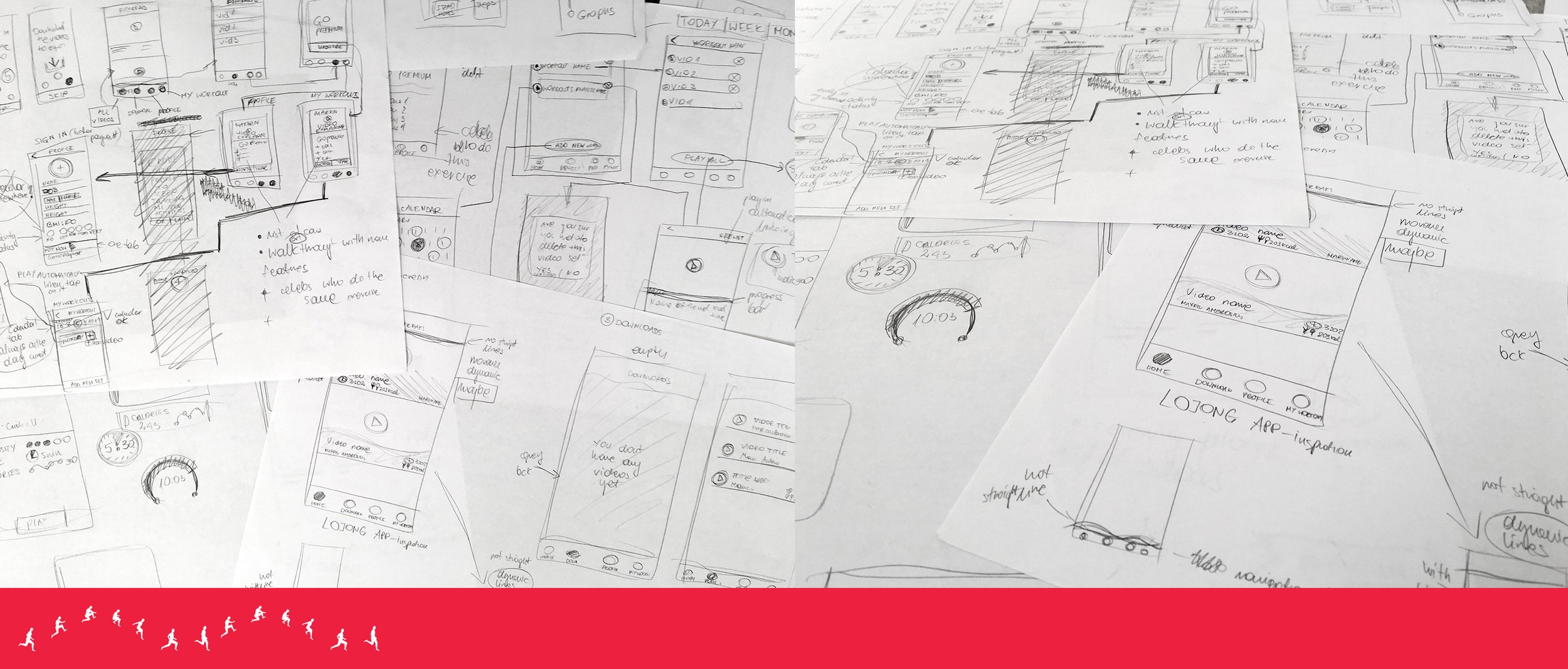
The redesign process began with reviewing the strengths and limitations of the first version of the application. User requirements, business goals, and planned functionality for future releases were analysed to identify opportunities for improvement. Before moving into digital design, a series of sketches were created to explore different approaches to navigation, content organisation, and feature integration.
The sketching phase allowed multiple concepts to be developed quickly and evaluated without the constraints of detailed visual design. Particular attention was given to how new premium features, workout tracking, personal statistics, and Apple Watch integration could be incorporated into the existing ecosystem while maintaining a simple and intuitive user experience. These early concepts helped establish the foundation for the next stage of development.
Building the First Iteration with Future Growth in Mind
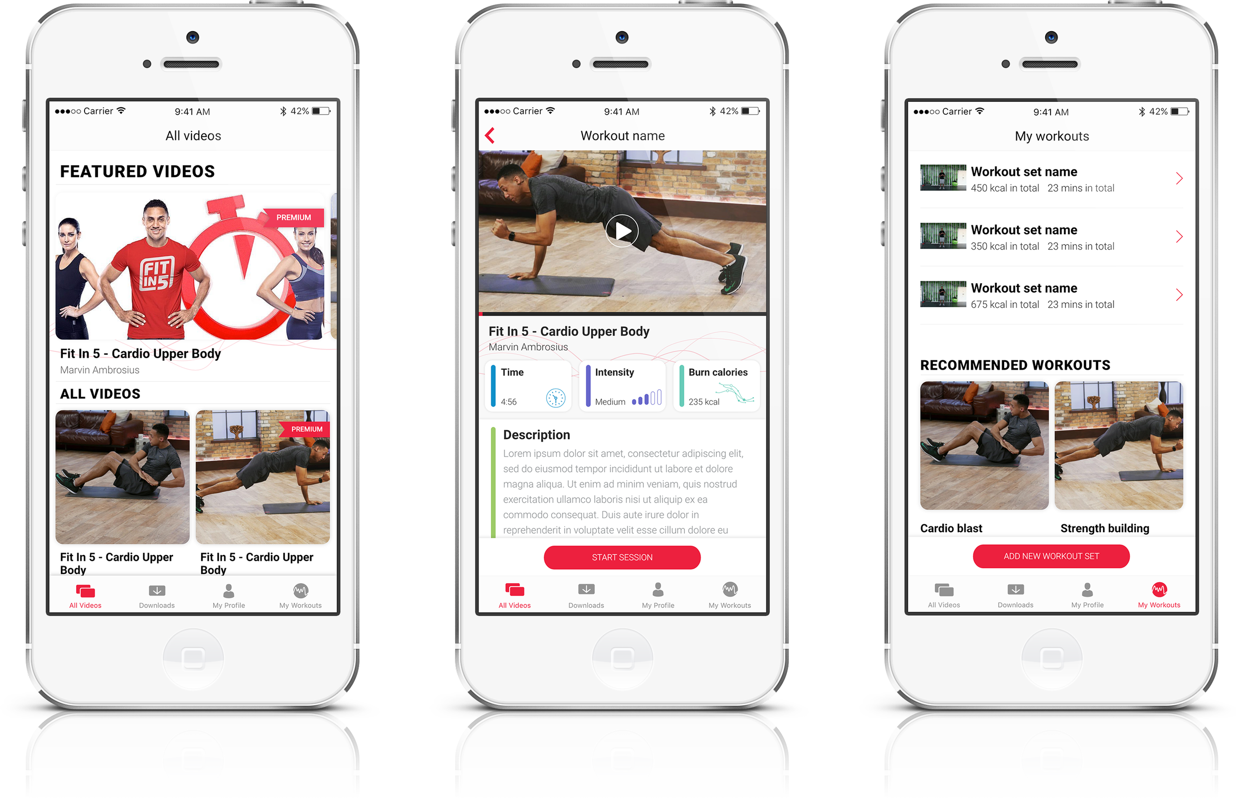
Although the first version of the application was designed to fulfil the immediate requirements of the project, scalability was an important consideration from the beginning. The initial architecture, navigation structure, and content hierarchy were created with future expansion in mind, allowing new features and services to be introduced without requiring a complete redesign of the product.
This forward-thinking approach made it possible to evolve the application into a more comprehensive fitness platform during the second iteration. Features such as user profiles, subscription-based services, activity tracking, and personalised workout management were anticipated during the original design process, ensuring that future development could be implemented efficiently and consistently.
Wireframing and User Experience Development
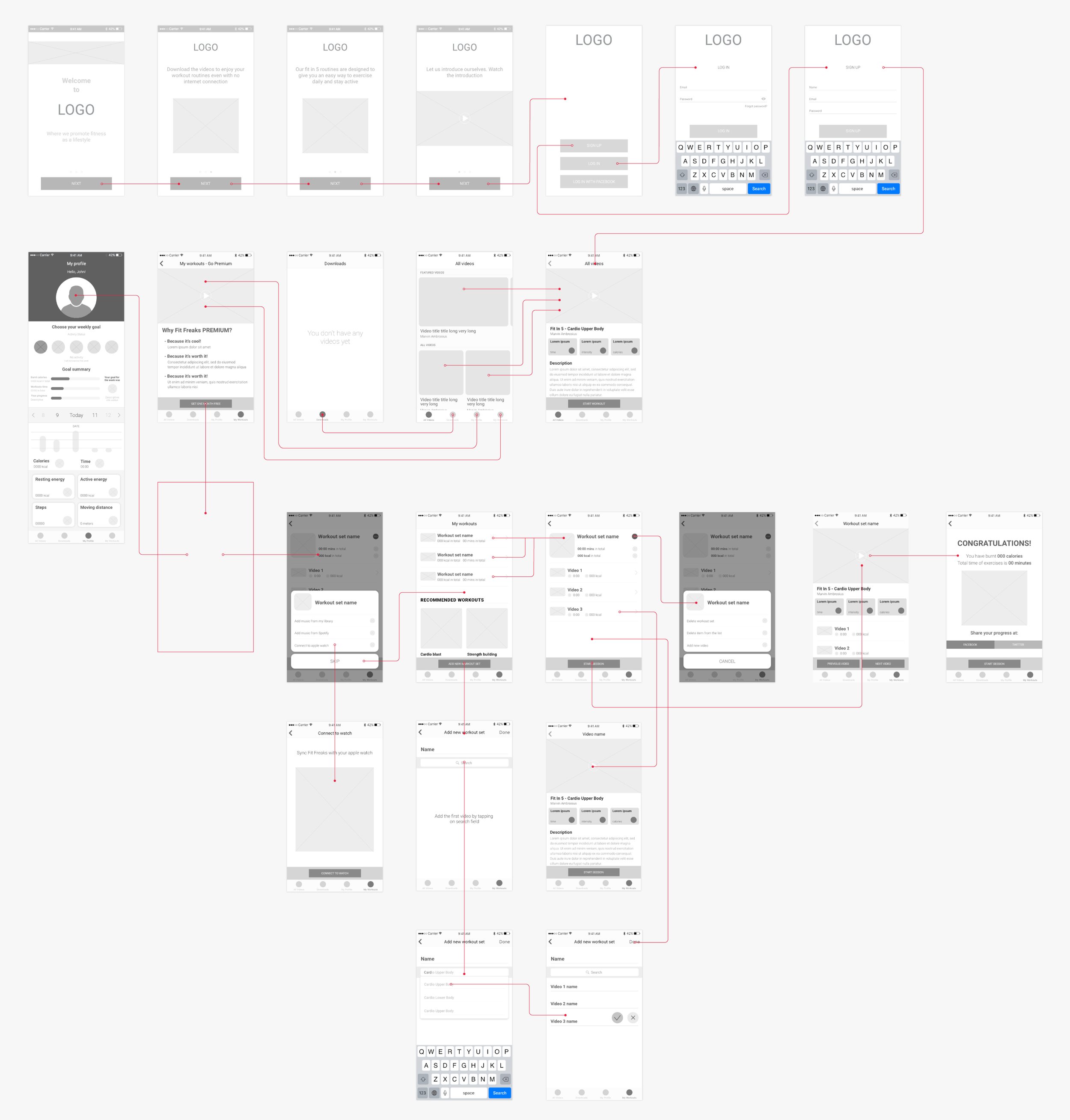
Following the sketching stage, detailed wireframes were created to define the structure and functionality of the redesigned application. The wireframes focused on user interactions, content placement, and workflow optimisation rather than visual appearance. This stage enabled key user journeys to be tested and refined before moving into high-fidelity design.
Special attention was given to the organisation of workout content, personal activity data, subscription features, and account management tools. By simplifying interactions and reducing unnecessary steps, the redesigned experience aimed to make it easier for users to access workouts, monitor progress, and engage with the platform on a daily basis.
User Flow Optimisation
A significant part of the redesign process involved reviewing and refining the user flows established during the first iteration. As new features were introduced, existing journeys were reassessed to ensure they remained intuitive and efficient.
New workflows were designed for premium subscription management, workout planning, profile personalisation, and Apple Watch synchronisation. User flows were carefully mapped to ensure that both new and existing users could navigate the application naturally, with clear pathways between workouts, personal statistics, achievements, and account settings.
The objective was to create a seamless experience that encouraged long-term engagement while supporting users at different stages of their fitness journey.
Evolution of the Final Design
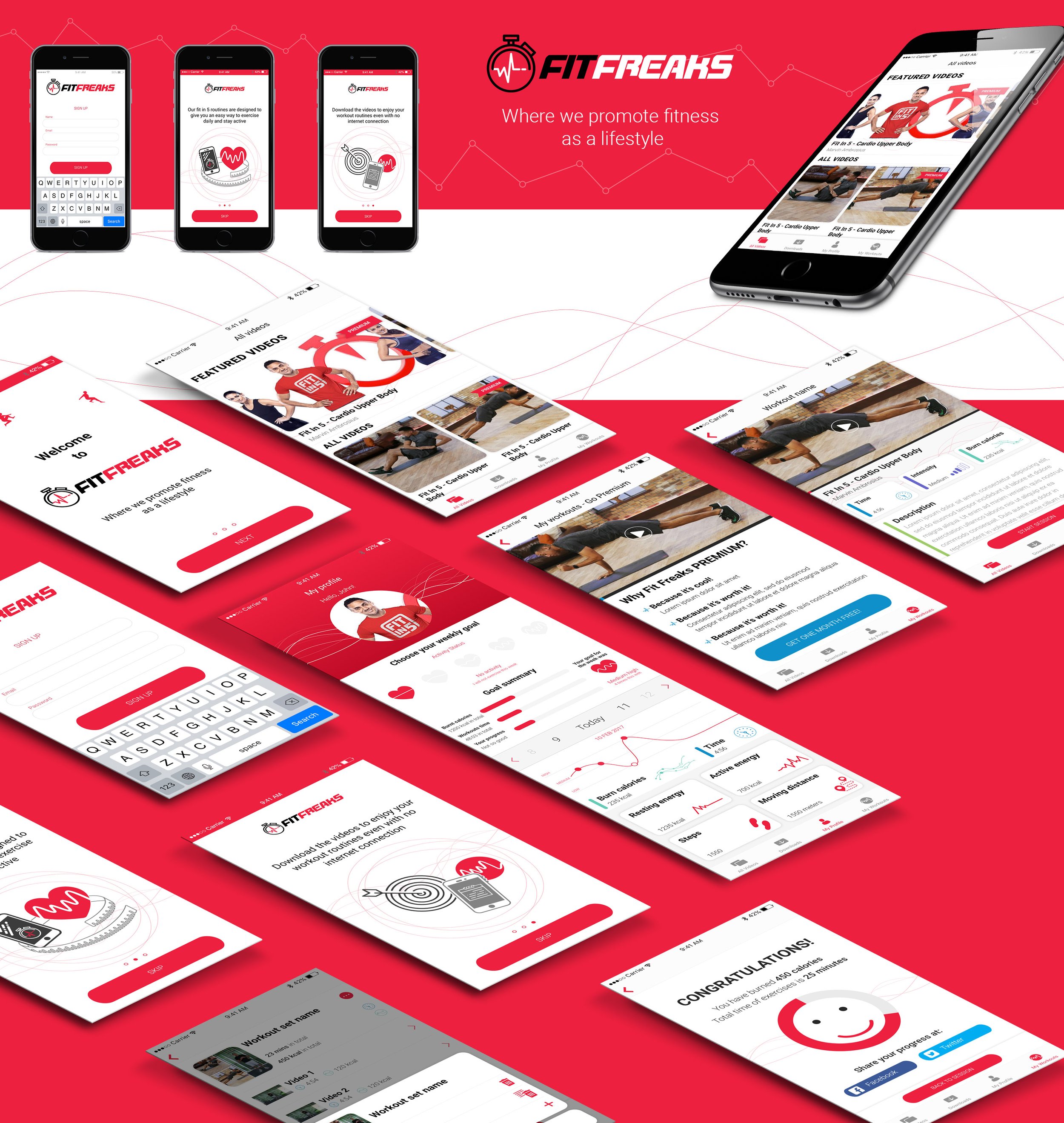
The second iteration represented both a functional and visual evolution of the original application. While the first version established the core experience, the redesign introduced a more refined interface, improved content hierarchy, and enhanced visual consistency throughout the product.
Layouts were streamlined to improve readability and usability, while new components were introduced to accommodate expanded functionality. The visual language was modernised through updated typography, iconography, spacing, and interface elements, creating a cleaner and more engaging user experience.
Additional screens were designed to support subscription services, activity summaries, personal goals, and Apple Watch integration. Custom icons were also developed for onboarding screens and navigation elements, helping to strengthen the overall visual identity of the application.
The result was a more mature and feature-rich product that successfully expanded upon the foundations established during the first iteration while maintaining a consistent and user-centred design approach.