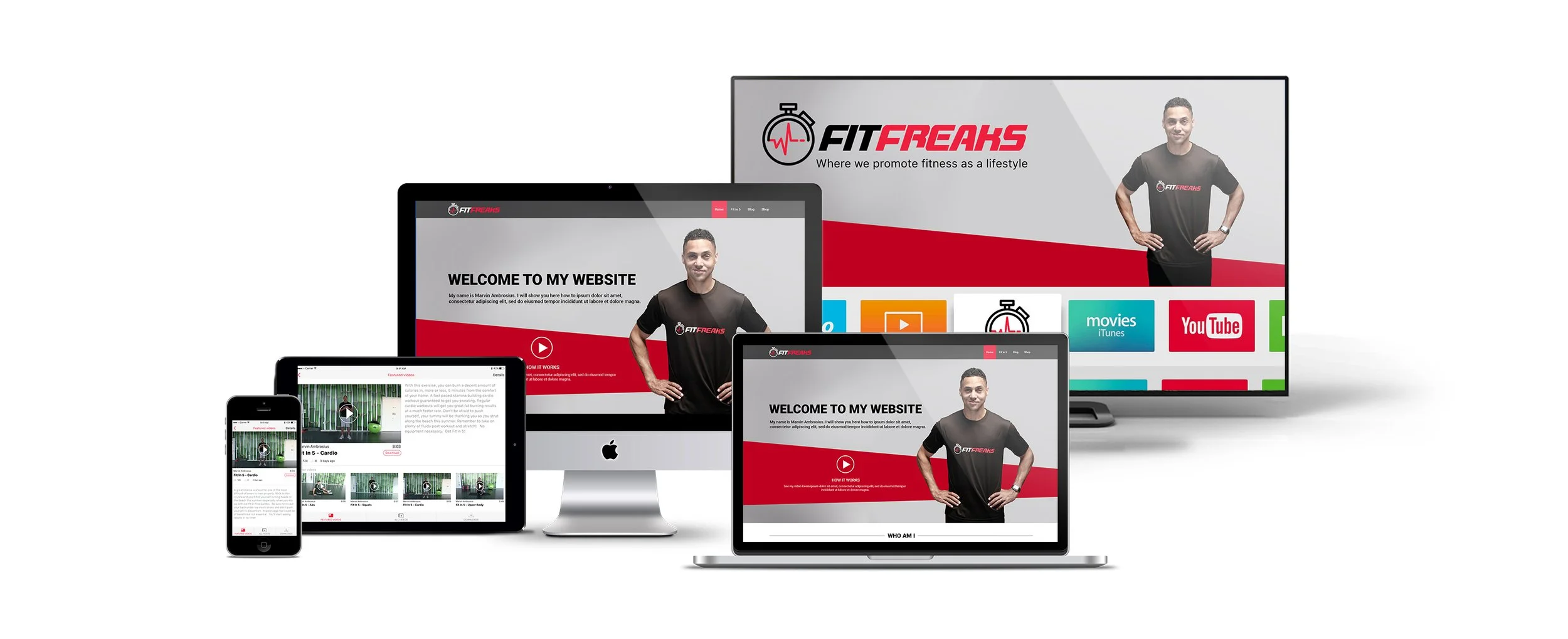
Fit Freaks is a fitness community platform created to promote a healthy lifestyle through short but highly effective workout routines. Founded by certified Insanity instructor Marvin Ambrosius, the concept centres around Fit in 5 – intensive five-minute workouts designed for people who struggle to find time for longer exercise sessions. The programme focuses on key muscle groups to help improve fitness, support weight loss, increase strength, and encourage long-term healthy habits.
I was involved in the design of the Fit Freaks ecosystem across multiple platforms, including native iOS and Android applications, tablet experiences, the website, and Apple TV. This complex and multi-steps project was developed within the scope of my work for iMobilize. Link to the website - here. Below you will find the Case Study with the development of the specific steps.

Apps Design Process
The design process began with a detailed discovery phase, where client requirements, business goals, user needs, and existing brand guidelines were reviewed. Through a series of discussions and planning sessions, we identified the key functionality required for the platform and established the overall direction of the product.
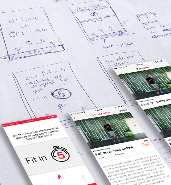
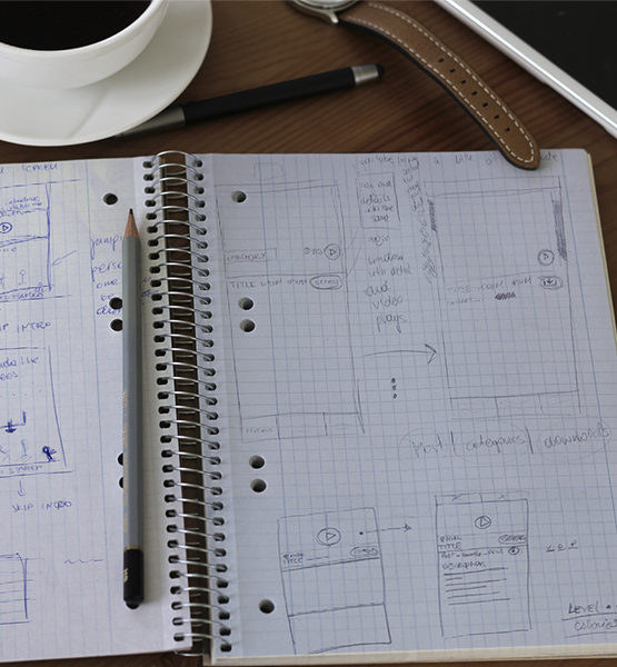
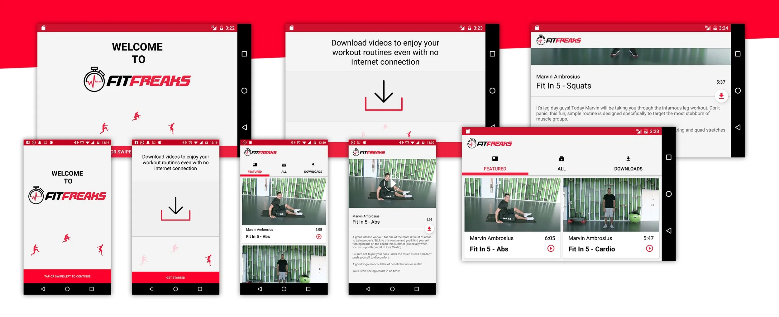
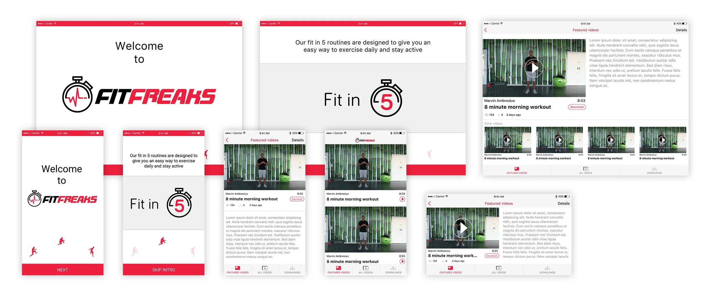
Sketching played a significant role in the early stages of the project. Before moving into digital wireframes, I explored multiple concepts through hand-drawn sketches to test navigation patterns, screen layouts, content hierarchy, and user journeys. This approach allowed ideas to be evaluated quickly and helped identify the most intuitive workflows before investing time in detailed design. The sketches evolved into low-fidelity wireframes, where user interactions and screen-to-screen transitions were refined and validated against the project objectives.
Once the user flows and wireframes were approved, I developed the visual design across all platforms. The goal was to create a clean, professional, and modern user experience while maintaining consistency throughout the ecosystem. Particular attention was given to usability, ensuring that users could easily access workouts, monitor progress, and engage with the Fit Freaks community regardless of the device they were using.
Following the success of the original platform and applications, I worked on the second edition of the Fit Freaks iOS application. This phase of the project involved a complete redesign and expansion of the existing product. Starting with new requirements and feature planning, I redesigned the user experience from the ground up, creating updated user flows, wireframes, and interface designs in line with both client expectations and established brand guidelines.
The new version introduced premium subscription functionality, allowing users to access additional features such as My Workouts and My Profile. Workout content was expanded with more detailed information, and the application was enhanced with Apple Watch integration, enabling users to synchronise their fitness data and track activity more effectively. Within their personal profiles, users could set weekly goals and review activity summaries, including active energy, resting energy, step counts, and distance travelled.
Beyond the functional improvements, the visual identity of the application was refreshed to create a more contemporary and engaging experience. As part of the redesign process, I also created custom iconography for the onboarding walkthrough screens and designed the application's primary tab bar icons, ensuring consistency throughout the user interface.
The final result was a cohesive digital fitness platform that successfully combined intuitive user experience, strong visual design, and scalable functionality across multiple devices and user touchpoints.
See the full description of the iOS app development example by clicking the button below.
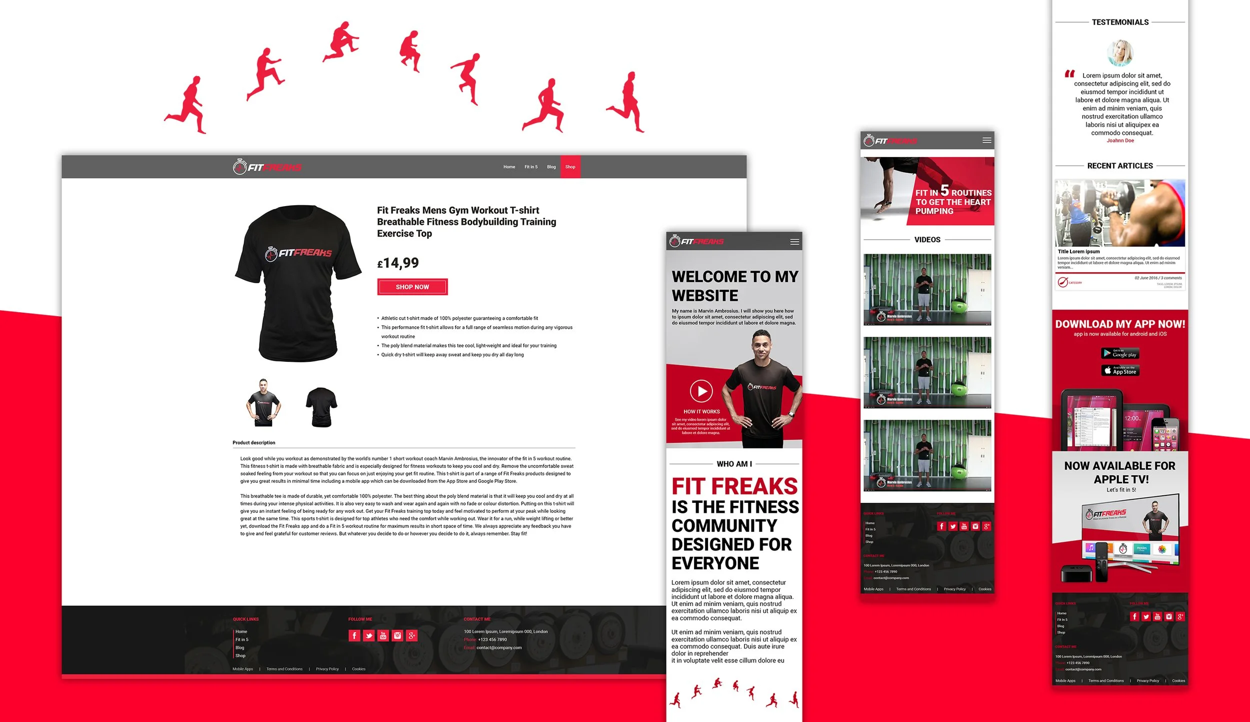
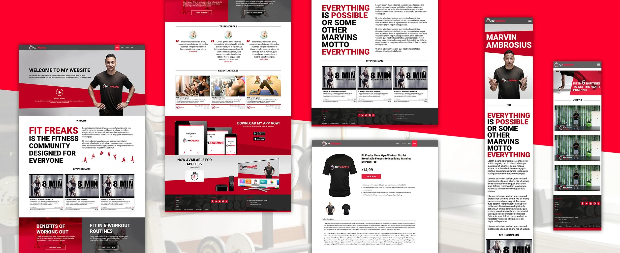
Website Development
The website project began with understanding the client's objectives, target audience, business requirements, and brand identity. During the discovery phase, meetings and discussions helped define the project's goals, key functionality, content requirements, and overall visual direction. When available, existing brand guidelines were reviewed and extended to ensure consistency throughout the design process.
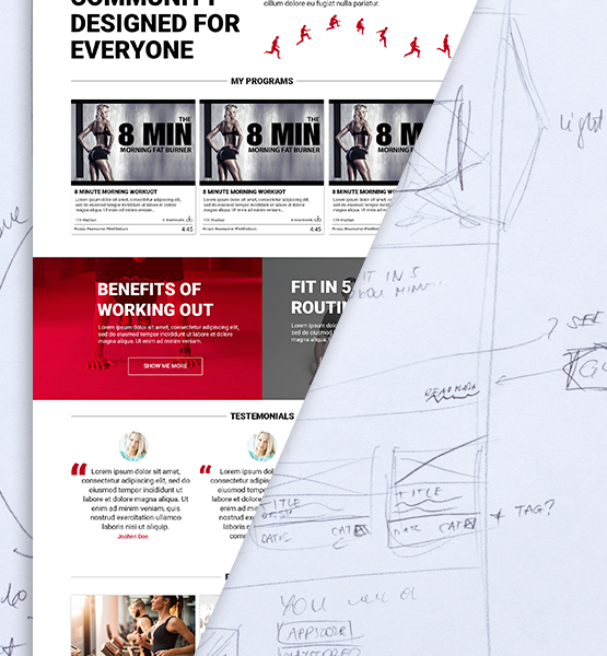
The concept phase started with hand-drawn sketches, allowing different ideas and layouts to be explored quickly. Sketching helped identify the most effective page structure, content hierarchy, navigation patterns, and user journeys before moving into digital design. Multiple concepts were considered and refined to determine the best solution for both user needs and business goals.
Once the initial direction has been established, the sketches were translated into wireframes. These low-fidelity layouts focused on functionality, page structure, and user experience without the distraction of colours or visual styling. Wireframes allowed workflows and interactions to be tested and reviewed with the client, ensuring that the overall structure met project requirements before progressing further.
Following client approval, the project moved into the user interface design phase. Visual elements such as typography, colour palettes, imagery, iconography, and interactive components were introduced to create a cohesive and engaging experience. Throughout this stage, regular feedback and revisions ensured that the design aligned with both client expectations, user needs and brand guidelines.
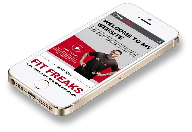
The final designs were prepared with attention to usability, accessibility, and consistency across all pages and devices. The result was a fully realised website design that combines strong visual communication with an intuitive and user-centred experience.
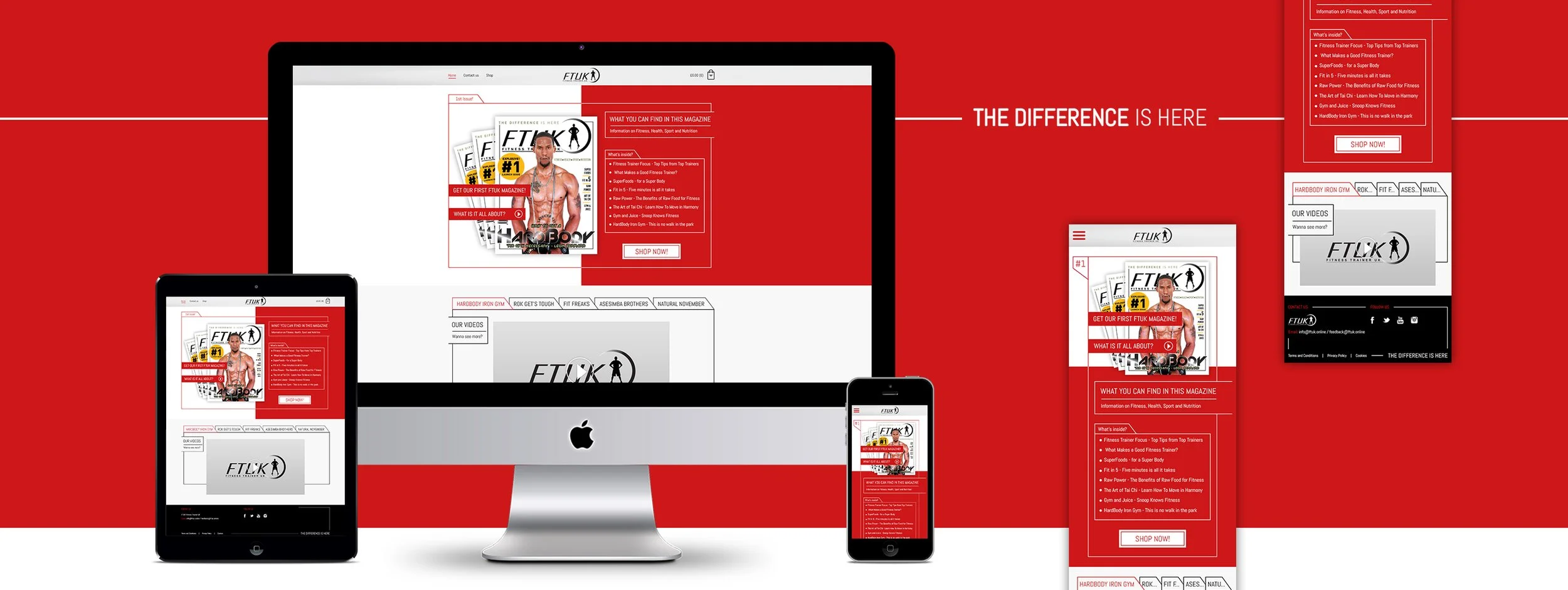
FTUK Magazine
FTUK Magazine is a UK health and fitness publication created by Fitness Trainer UK, providing readers with expert fitness advice, workout guidance, nutritional insights, and articles focused on healthy living and wellbeing.
The client required an e-commerce website that would allow readers to browse and purchase magazine issues online while maintaining a strong connection to the publication's visual identity. The logo and core branding elements had already been established, and my role was to design a website that reflected both the magazine's editorial style and the existing FTUK brand.
The project began with an analysis of the client's requirements and target audience. Initial concepts were explored through sketches and layout studies, focusing on how to translate the visual language of a printed magazine into a digital shopping experience. Particular attention was given to content hierarchy, readability, and the presentation of featured articles and publications.
Following the concept stage, sketches were created to define the structure and user journey of the website. Once approved, the visual design phase focused on creating a modern and engaging interface that balanced editorial aesthetics with e-commerce functionality. The final design successfully incorporated magazine-inspired layouts while maintaining a clear and intuitive shopping experience for users.
The project was completed within the scope of my work for iMobilize.